
HTML と CSS のテスト
最終更新:2024/06/07
初出:2020/06/27
- 目次
-
右から左に流れる文字
追加:2024/06/07
@keyframes を使って右から左に流れる文字を作ってみた。昔の HTML 要素 marquee のような動作である。短いメッセージの表示に使えそうである。
右から左に文字が流れる
- ● CSS
-
- p.marquee-anim {width: 90%; margin-inline: auto; padding: 0.5em 0; overflow: hidden; border: teal 1px solid; background-color: beige; color: crimson;}
- span.marquee-span {display: inline-block; padding-left: 100%; white-space: nowrap; animation: marquee 5s linear infinite; animation-fill-mode: forwards; /* 再生回数限定時に必要 */}
- @keyframes marquee {
- from {transform: translate(0);}
- to {transform: translate(-100%);}
- }
- ● HTML
-
- <p class="marquee-anim">
- <span class="marquee-span">右から左に文字が流れる</span>
- </p>
「span.marquee-span」の部分の CSS は表示する領域の指定である。「overflow: hidden」によってはみ出した部分は隠している。
「animation」で始まる宣言でどういう風に文字が流れるかを指定する。「marquee」はこの動作の名前なので何でも良いが、@keyframes の直後の文字列と合わせる必要がある。
「5s linear infinite」は、1回 5 秒間、直線状に無限ループという指定なので、infinite(無限)の代わりに整数を入力すると、その回数再生する。
「animation-fill-mode: forwards」は、再生後は @keyframes の 100% の表示のままで残すという指定。指定回数再生した後消えてしまって良い場合や無限ループの場合は不要。
キーフレームの中の from と to は、開始時と終了時の状態の指定。0% と 100% に変えても同じ意味。translate 関数は位置調整。% 値を使うと要素の大きさを基準とするようになる。再生回数を指定した上で「to {transform: translate(-50%)}」とすると、中央で停止する。
li::after でマーカー変化他
追加:2024/03/07
li 要素に疑似要素 ::after を付けてマーカーを出現させるだけでなく、他の要素や :hover 疑似クラスとも組み合わせ、変化させてみた。
- ● CSS
-
- ul.menu-list2 {padding: 0; width: 90%; margin: 20px auto; list-style-type: none;
display: flex; flex-wrap: wrap;}
- .menu-list2 > li {width: 50%; padding: 10px; box-sizing: border-box;
border-bottom: black solid 1px; position: relative;}
- .menu-list2 > li:nth-last-of-type(even) {border-left: 1px solid black;}
- .menu-list2 > li::after {content: "▶"; position: absolute; top: 50%; right: 10px;
transform: translateY(-50%); color: brown;}
- .menu-list2 a {color: #333; text-decoration: none; display: block;}
- li#language {width: 100%; border-bottom: black solid 3px; padding: 10px;}
- #language::after {display: none;}
- #language summary {list-style-type: none; position: relative;}
- #language summary::after {content:"▶"; color: brown; position: absolute; top: 50%; right: 0; transform: translateY(-50%);}
- #language summary:hover::after {content: "▼"; color: brown; position: absolute; top: 50%; right: 0; transform: translateY(-50%);}
- ul.lang-list {font-weight: normal; display: none;}
- #language:hover ul.lang-list {display: block;}
- ● HTML
-
- <ul class="menu-list2">
- <li><a href="#">企業情報</a></li>
- <li><a href="#">採用情報</a></li>
- <li id="language">
- <details>
- <summary>Language</summary>
- <ul class="lang-list">
<li>日本語</li>
<li>English</li>
<li>中国语</li>
<li>その他(Other)</li>
- </ul>
- </details>
- </li>
- </ul>
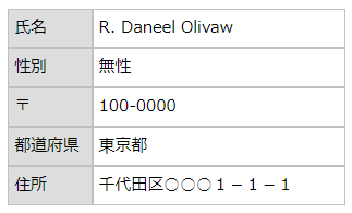
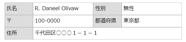
dl/dt/dd 要素で表作成
追加:2024/03/07
table 要素を使って表を作成するのは当たり前である。しかし、項目と値のペアが短い場合と長い場合が混在する場合、1行に th 要素が複数あるのは何か変である。しかも table 要素では、スマホ用表示の際に行の中のセルの数を減らすわけにはいかない。
そこで dl/dt/dd 要素で表を作成し、メディアクエリーでの項目・値のセット減少に対応させた。
- 氏名
- R. Daneel Olivaw
- 性別
- 無性
- 〒
- 100-0000
- 都道府県
- 東京都
- 住所
-
千代田区○○○1-1-1
ちなみに上の表は次のように変形する(スマホで見た場合、画像が小さくなって見にくいが......)。
- ● CSS
-
- dl.entry-data {width: 90%; margin: 10px auto; display: flex; flex-wrap: wrap; align-items: center;}
- .entry-data > dt, .entry-data > dd {border: silver solid 1px; padding: 5px; box-sizing: border-box; height: auto; min-height: 36px;}
- .entry-data > dt {width: 16%; background-color: #ddd;}
- .entry-data > dd {margin-left: 0; width: 34%;}
- .entry-data > dd.ever {width: 84%;}
- @media screen and (max-width: 710px) {
- .entry-data > dt {width: 25%;}
- .entry-data > dd, .entry-data > dd.ever {width: 75%;}
- }
- ● HTML
-
- <dl class="entry-data">
- <dt>氏名</dt>
- <dd>R. Daneel Olivaw</dd>
- <dt>性別</dt>
- <dd>無性</dd>
- <dt>〒</dt>
- <dd>100-0000</dd>
- <dt>都道府県</dt>
- <dd>東京都</dd>
- <dt>住所</dt>
- <dd class="ever">千代田区○○○1-1-1
- </dd>
- </dl>
transform: translate(値) で中央配置
追加:2024/02/12
親要素の中央に子要素を配置する方法はいくつかあるが、transform: translate(値) での方法を試してみた。

テキストテキストテキストテキストテキストテキストテキストテキストテキストテキストテキストテキストテキスト
条件は、
- skyblue の太枠の横幅は 90%、本来の高さ 50vh(このページで作図する都合で実際には 300px に設定)。
- slategray の部分の高さは 50px。
- figure 要素で作成する内側の黒枠の幅は skyblue の枠の 80%。
- 内側の枠をページュの部分の上下左右の中央に配置。
この条件では、ベージュ部分の本来の高さは calc(50vh - 50px) であり、vh なので端末によって高さが変わるが、ベージュ部分の上端、下端とのマージン、左端、右端とのマージンを等しくするというお題である。
そこで考えたのが次のソース。
- ● CSS
-
- div.outer {margin: 10px auto; width: 94%; height: 50vh; background-color: beige; border: skyblue solid 3px;
position: relative;}
- .outer > div.header {height: 50px; background-color: slategray;}
- figure.inner {width: 80%; margin: 0; display: flex; justify-content: center; box-sizing: border-box; align-items: flex-start; gap: 10px; border: black solid 1px; padding: 10px;
position: absolute; top: calc(25vh + 25px); left: 50%; transform: translate(-50%,-50%);}
- .inner > img, .inner > div {width: 50%;}
- .inner > div {text-align: justify; font-size: 95%; line-height: 1.5;}
- .inner > img {aspect-ratio: 3 / 2;}
- ● HTML
-
- <div class="outer">
- <div class="header"></div>
- <figure class="inner">
- <img src="URL" alt="">
- <p>テキストテキストテキストテキストテキストテキストテキストテキストテキストテキストテキストテキストテキスト
- </p>
- </figure>
- </div>
- div class="outer" に position: relative
- figure lass="inner" に position: absolute
を適用するのは当然として、子要素に top: calc(25vh + 25px)、left: 50% で端との距離を指定しただけでは figure 要素として X軸(左右)、Y軸(上下)の中央にはならない。左上が中央になってしまうのである。それを補整するのが、
- transform: translate(-50%,-50%)
である。translate 関数の値を % で指定した場合は、要素自身の大きさに対するパーセンテージ となる。なお、translate 関数には translateX、translateY、translateZ、translate3d という兄弟が存在する。
ul/li 要素で細い罫線の枡目
追加:2023/12/31
ul/li 要素で表を作成し、しかもその内側の罫線を細く表示する、というお題(下の表)で CSS を考えてみた。
- ul 要素に対して 左右の margin を auto、padding は 0、マーカー無し、flexbox 適用(改行可)
- li 要素に対して padding が 0、太さ 1 px の黒の実線で border、おまじないの box-sizing: border-box
まではすぐにわかった。しかしそのままでは内側の罫線が太くなってしまう。その対策は......
1列目と2列目の li 要素の border-right を対象にするセレクタは ~:nth-of-type(3n+○)であろう。
問題は3番目の li 要素までを対象とするセレクタである。:nth-of-type の引数をどう記述したら良いのだろうか? 思い浮かばなかったのでネット検索したら、なんと「(-n+3)」が答えであった。こんな指定の仕方があったとは......3番目以降ならば (n+3) だから、その逆という訳か(^^;;;
- ● CSS
-
- UL.thin-rules {list-style-type: none; width: 80%; height: 150px; margin: 20px auto; padding: 0; display: flex; flex-wrap: wrap; background-color: beige;}
- .thin-rules > li {padding: 0; width: calc(100% / 3); border: black solid 1px; box-sizing: border-box;}
- .thin-rules > li:nth-of-type(-n+3) {border-bottom: none;}
- .thin-rules > li:nth-of-type(3n+1), .thin-rules > li:nth-of-type(3n+2) {border-right: none;}
hover すると沈むハイパーリンク・ボタン
追加:2023/12/15
ボタンの上にマウスカーソルを hover するとそのボタンが沈み込むようにするにはどうしたらよいか?、という質問が某 Q&A サイトに投稿されたので調べてみた(私が食事をしたり少し調べている間になぜか質問が削除されてしまった)。
ボタンはおそらくハイパーリンクの a 要素を display: block でボタン化したものであろう。ボタン化することにより、文字のない padding 領域をクリックしてもハイパーリンクが機能するようになる。「hover すると」は「:hover」疑似クラスの利用であろう。そこまではすぐにわかったが、どうやったらボタンが沈むのか?
ネット検索した結果、タネ明かしは
- box-shadow プロパティによる影
- transition プロパティによる遅延
- transform: translate3d(~) プロパティによる変形
の利用であった。解説したサイト(複数)では影の色は常識的に「#000(black)」であったが、私は「transparent(透明)」に変えてみた。
- ● CSS
-
- UL.portal {padding: 0; width: 90%; margin: 10px auto; display: flex; justify-content: center; gap: 4px;}
- .portal>li {padding: 0; margin: 0; display: inline-block; flex: 1; height: 80px; border-radius: 8px; box-shadow: 0 5px 0 transparent; transition: 0.5s; display: flex; justify-content: center; align-items: center;}
- .portal>li a {display: block; color: white; text-decoration: none;}
- .portal>li:hover {transform: translate3d(0, 5px, 0); box-shadow: none;}
- .portal>li:first-of-type {background-color: orange;}
- .portal>li:last-of-type {background-color: blue;}
- ● HTML
-
- <ul class="portal">
<li><a href="https://www.yahoo.co.jp/">Yahoo!</a></li>
<li><a href="https://www.google.co.jp/">Google</a></li>
- </ul>
table 要素の列固定
追加:2023/02/24
表を作成しているときに、セルの横幅の合計が、main 要素の横幅よりも大きくなってしまった!なんて時に、昔は JavaScript を使っていたそうである。しかし、position: sticky というへんてこりんな宣言(プロパティ+値)が使えるようになったおかげで、私にも列固定ができるようになった。
なお、この宣言を使った場合、left: 0 も指定しないと、縦スクロールに追随してくれないので注意。
- ● CSS
-
- DIV.container {width: calc(90% - 20px); overflow: auto; margin: 10px auto;}
- TABLE.fixed-column {border-collapse: collapse; width: 645px;}
- .fixed-column TD {width: 160px; border: black solid 1px; height: 50px;}
- .fixed-column TD:first-child {background-color: khaki; color: black; position: sticky; left: 0;}
- .fixed-column TD:first-child::before {
content: ""; position: absolute; top: -1px; left: -1px; width: 100%; height: 100%; border: 1px solid black;}
- ● HTML
-
- <div class="container">
- <table class="fixed-column">
- <tr>
<td>1列目</td><td></td><td></td><td>4列目</td>
- </tr>
- <tr>
<td>1列目</td><td></td><td></td><td>4列目</td>
- </tr>
- </table>
- </div>
-
CSS の最後にある疑似要素 ~::before 以下が無くても列固定としては動作するが、これを付けないと、左罫線がチラチラすることを教えてくれたサイトがあった。